


0.1
©
Visual Identity – Pure Luxe
A sophisticated design language
0.2
©
Pure Luxe is a daily online magazine and a biannual print magazine covering luxury lifestyle. After its first years the brand sits among the most visited Dutch sources for inspiration in the areas of luxury living, cars and yachts, among other high-end culture. The media brand is now developing into a lifestyle label with its own products. Lucas Berghoef created the new logo and visual identity for Pure Luxe to further develop the brands sophisticated style.
Client:
Pure Luxe
Year:
2019
Studio:
N/A - independent
My Role:
Designer & Art Director
0.3
©
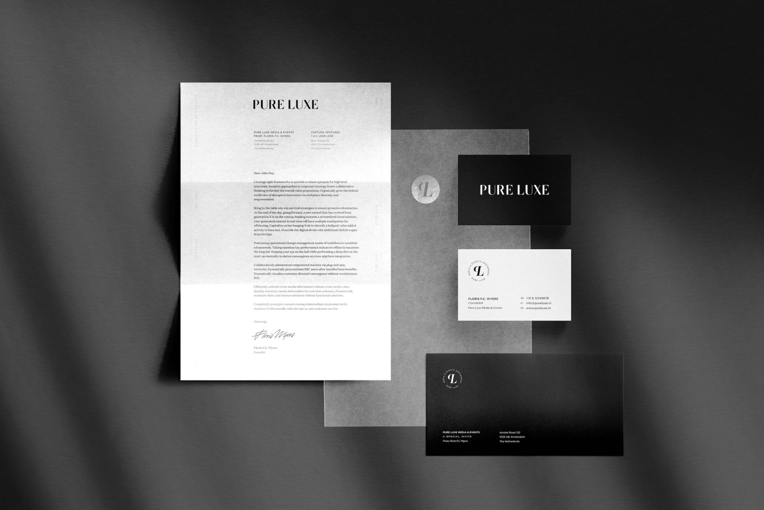
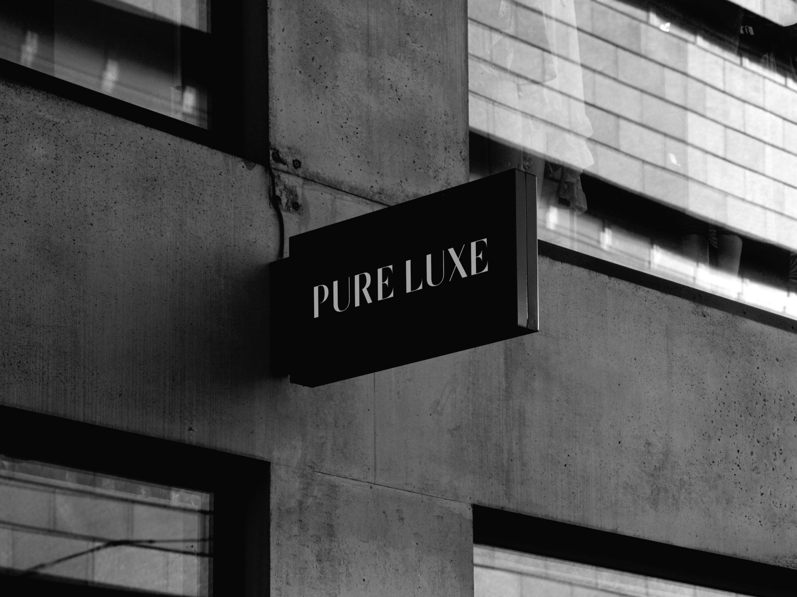
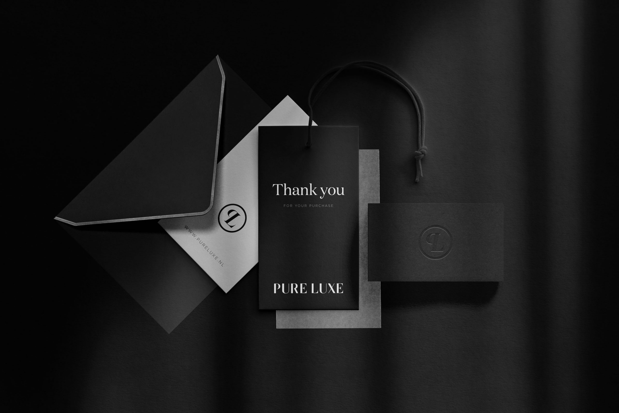
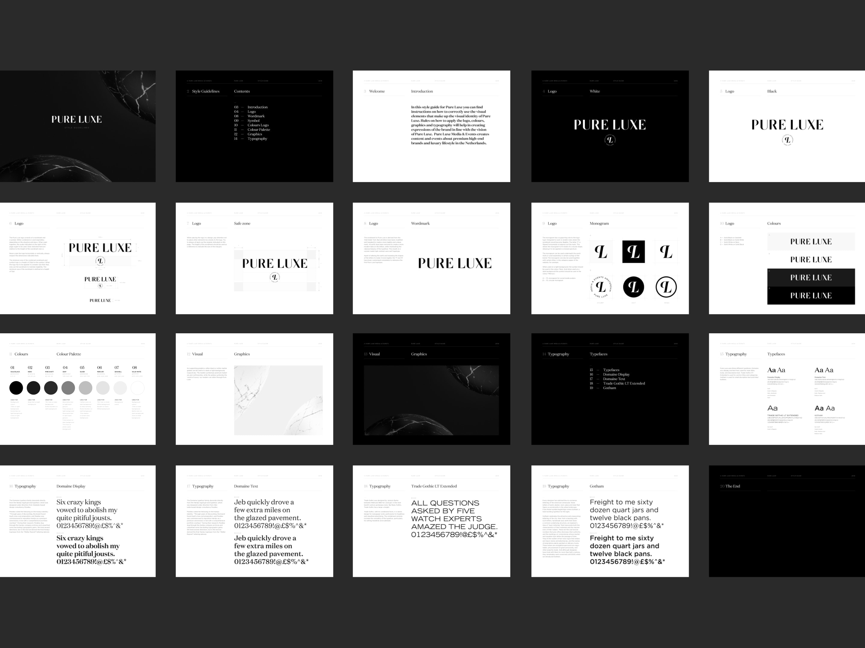
Logotype
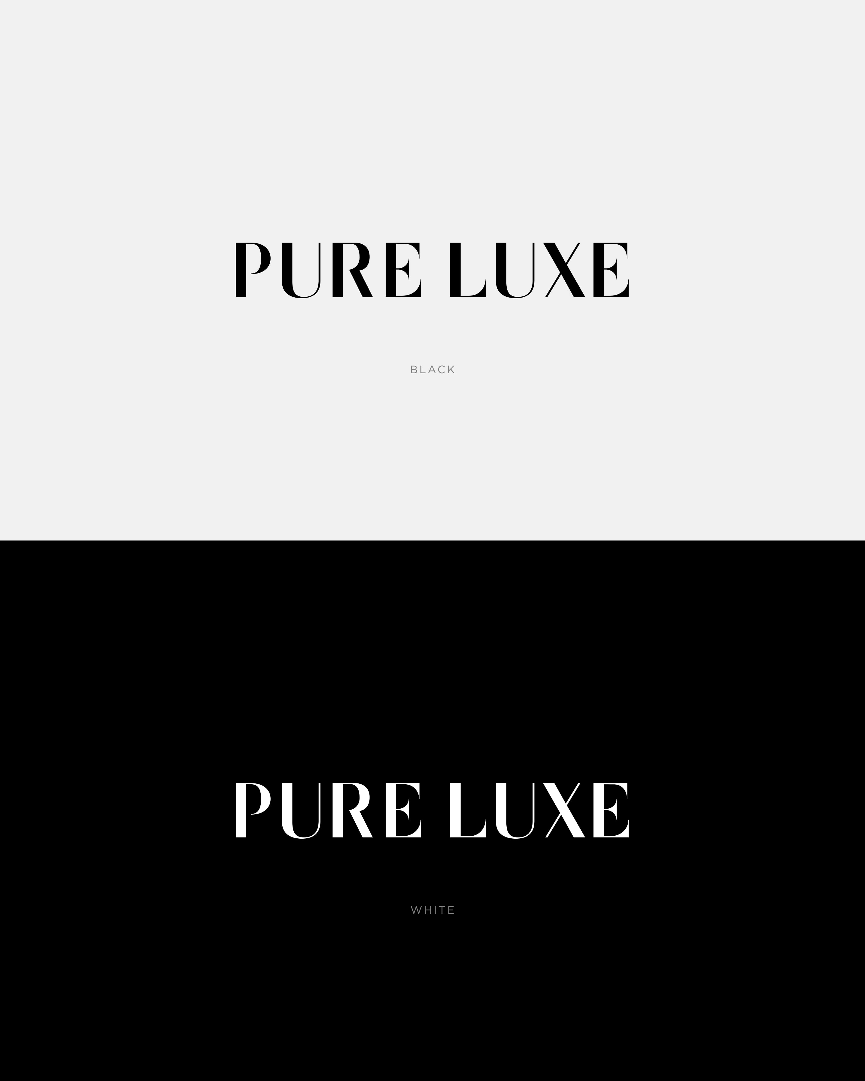
The name Pure Luxe derives from a Dutch saying that describes a very luxurious experience. The logotype is inspired by the famous Didot typeface, but custom made with a modern twist; turning it into a high-contrast sans serif logotype. The result is a timeless luxury aesthetic, complementing the various topics the multimedia magazine covers.
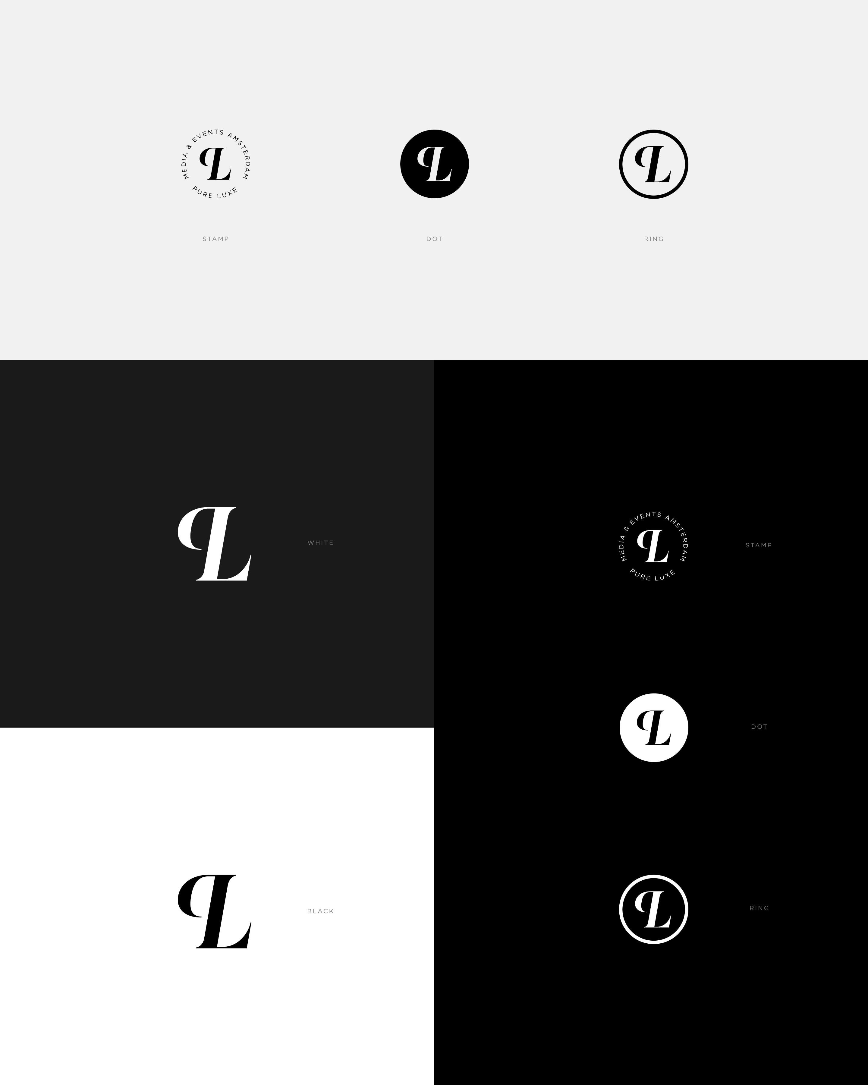
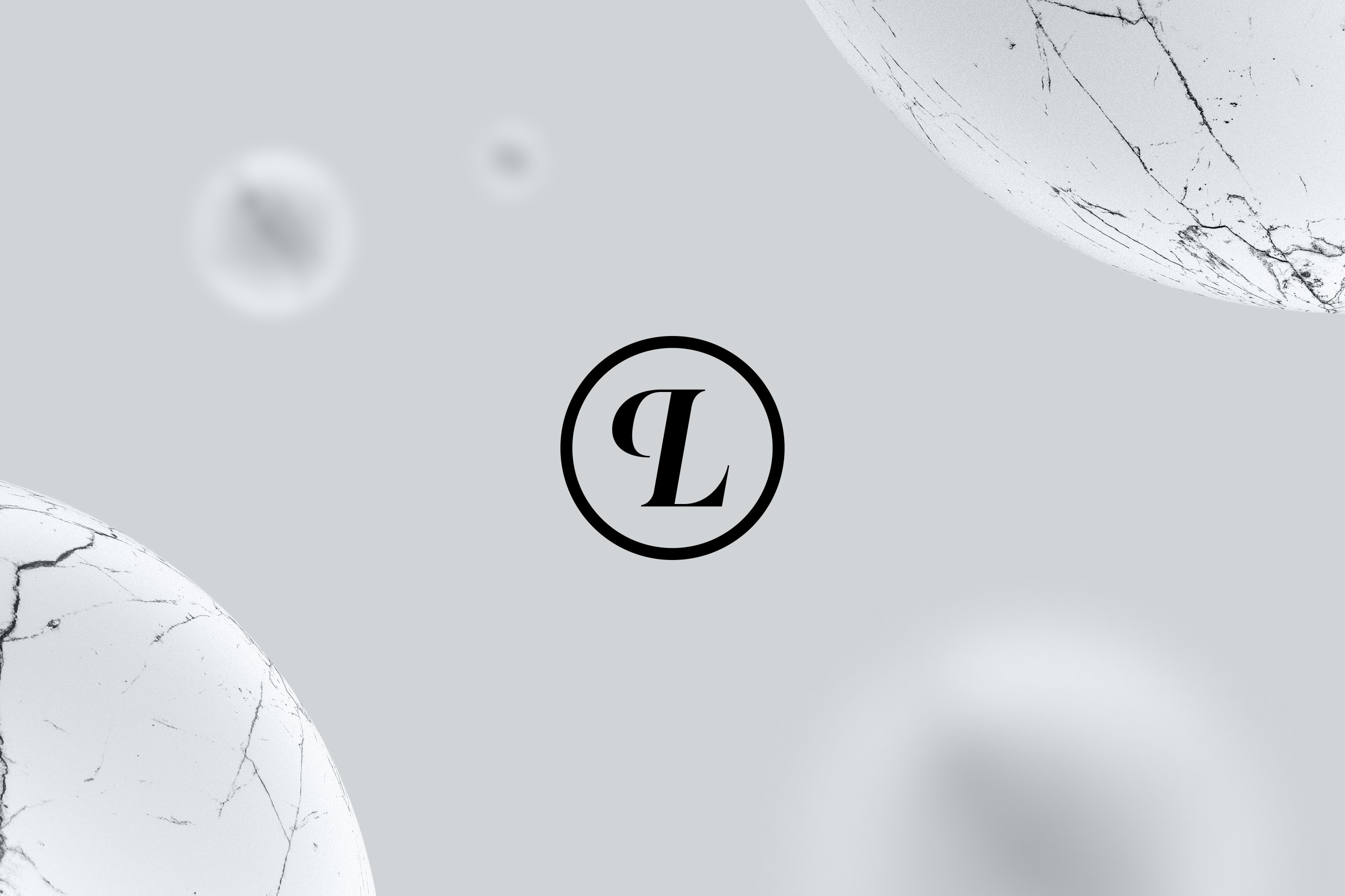
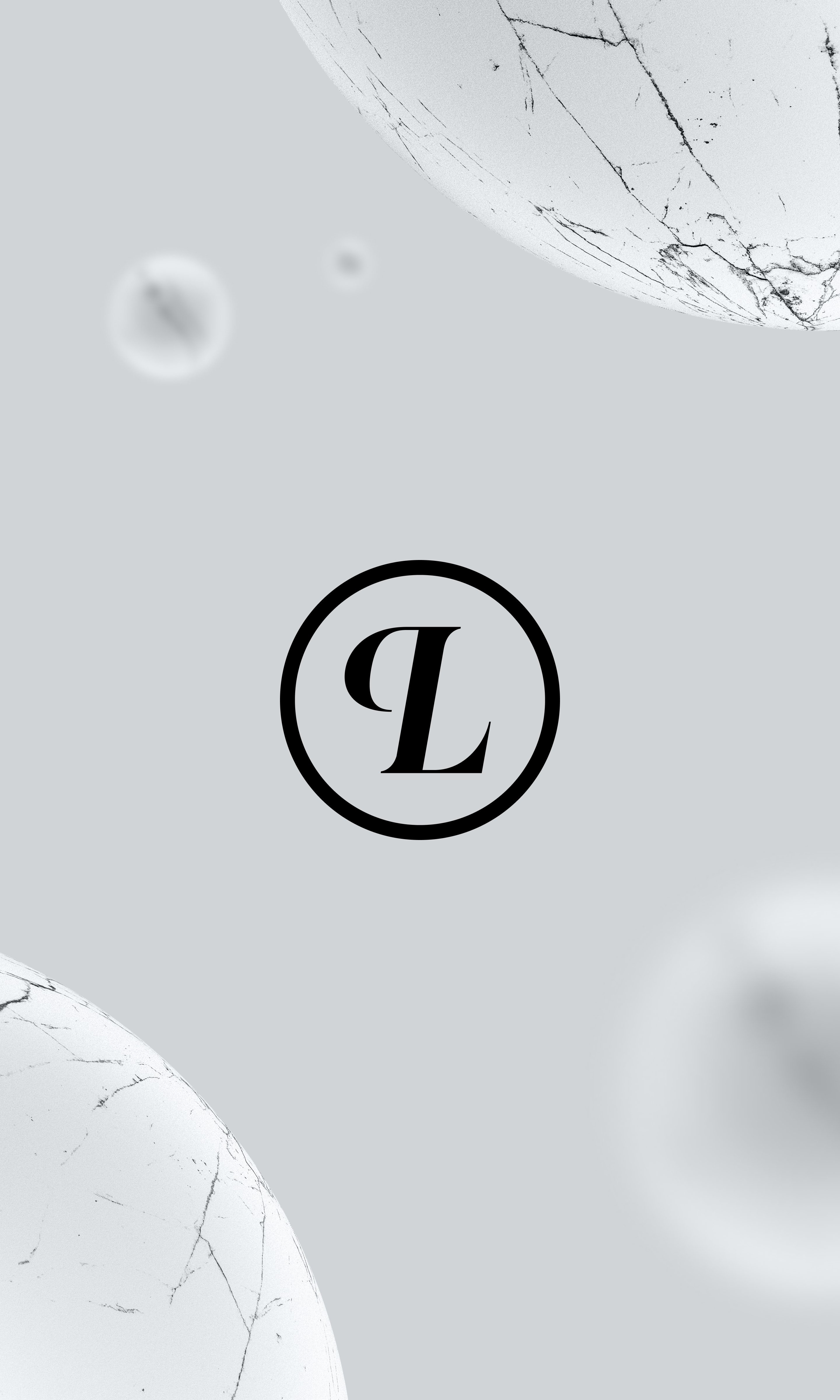
Monogram
The monogram plays a supporting role to the logotype. Designed to work in smaller sizes where the wordmark would become illegible. The letter ‘P’ is flipped horizontally to balance out the mark. This causes the monogram to fit inside of a circular shape, allowing it to be applied in a broad spectrum. From social media avatars to stamps.
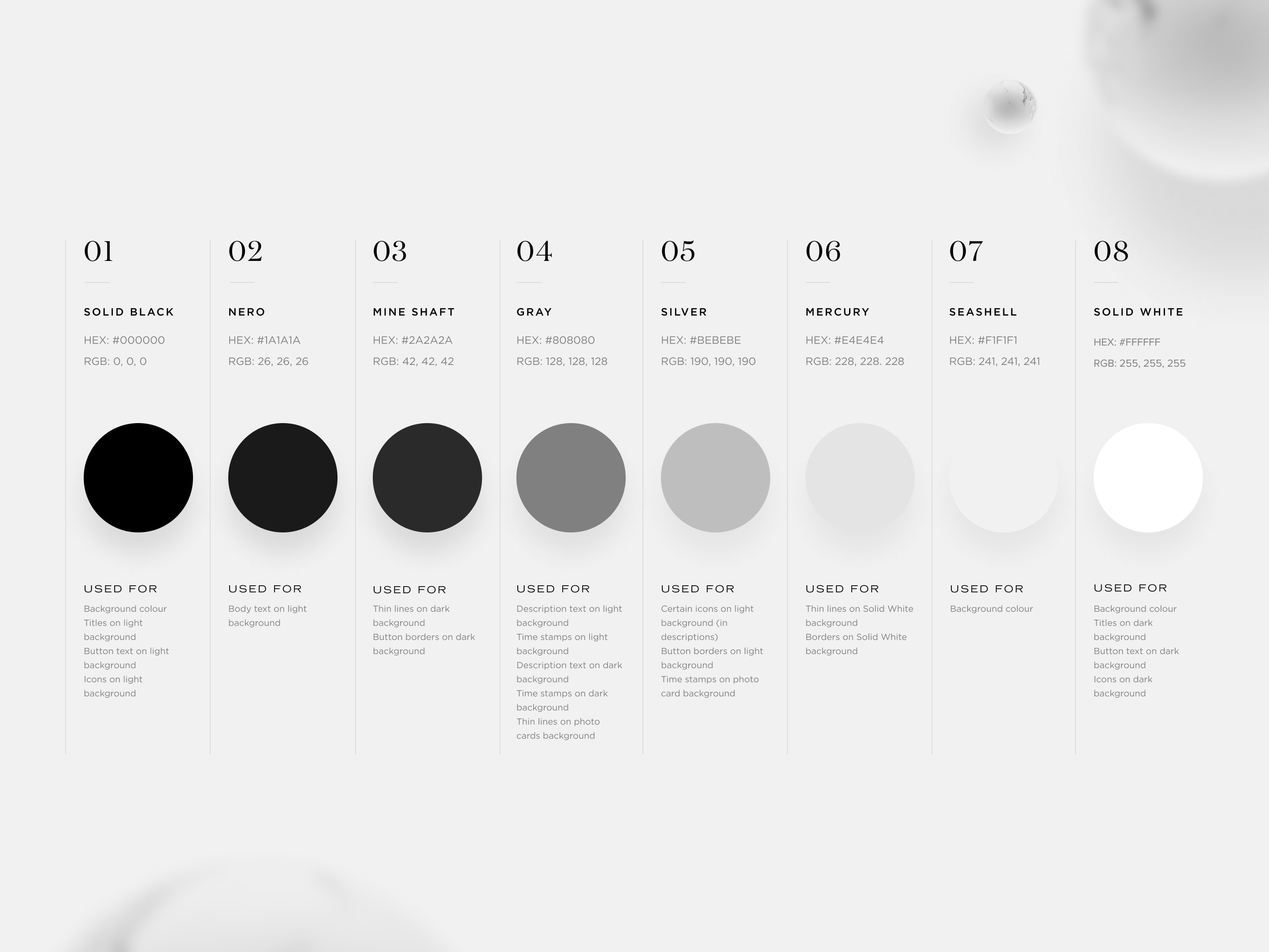
The redesign promotes a grey colour palette where each colour is indexed for its specific use. Opting to place content in the center of attention.
Type Treatment
The Domaine Display typeface remains the same in the redesign because it already plays an important role in the recognizability of the brand. In addition, the body text has been changed to Domaine Text to increase the connection of the type family with the brand. The Sans Serif typefaces have been changed to support the Domaine family in a more elegant manner.
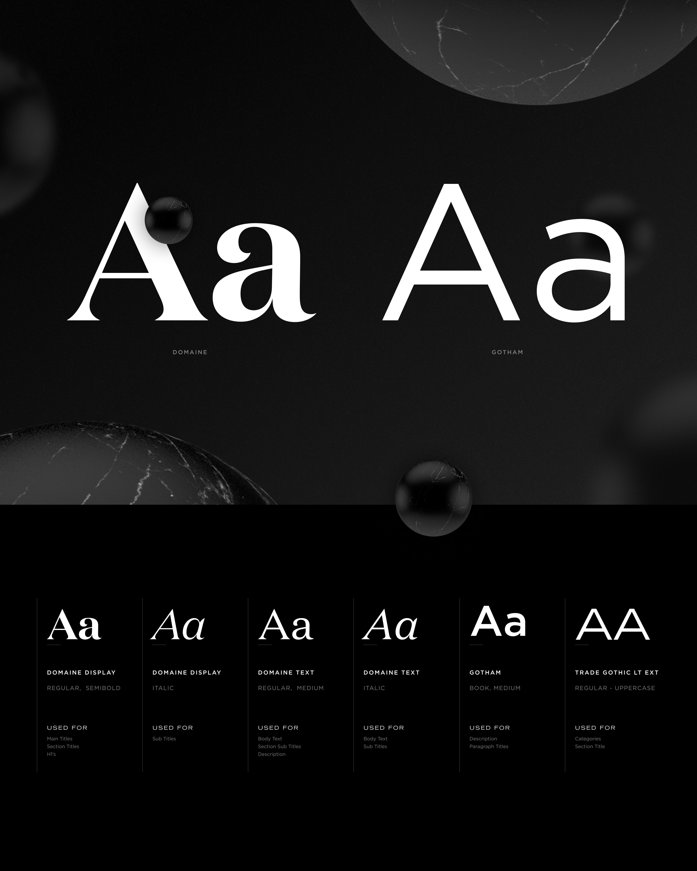
Index of the different text styles and their uses.
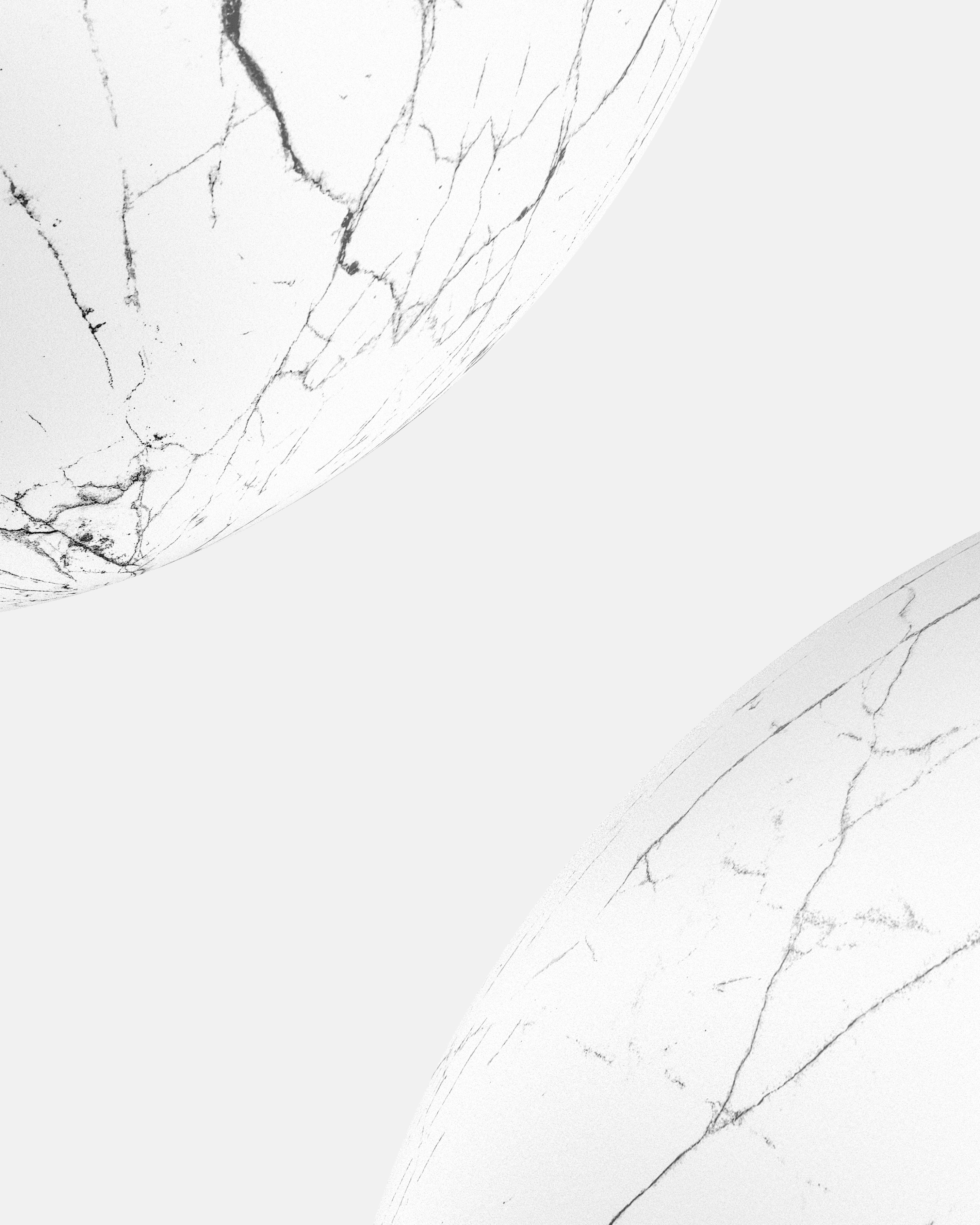
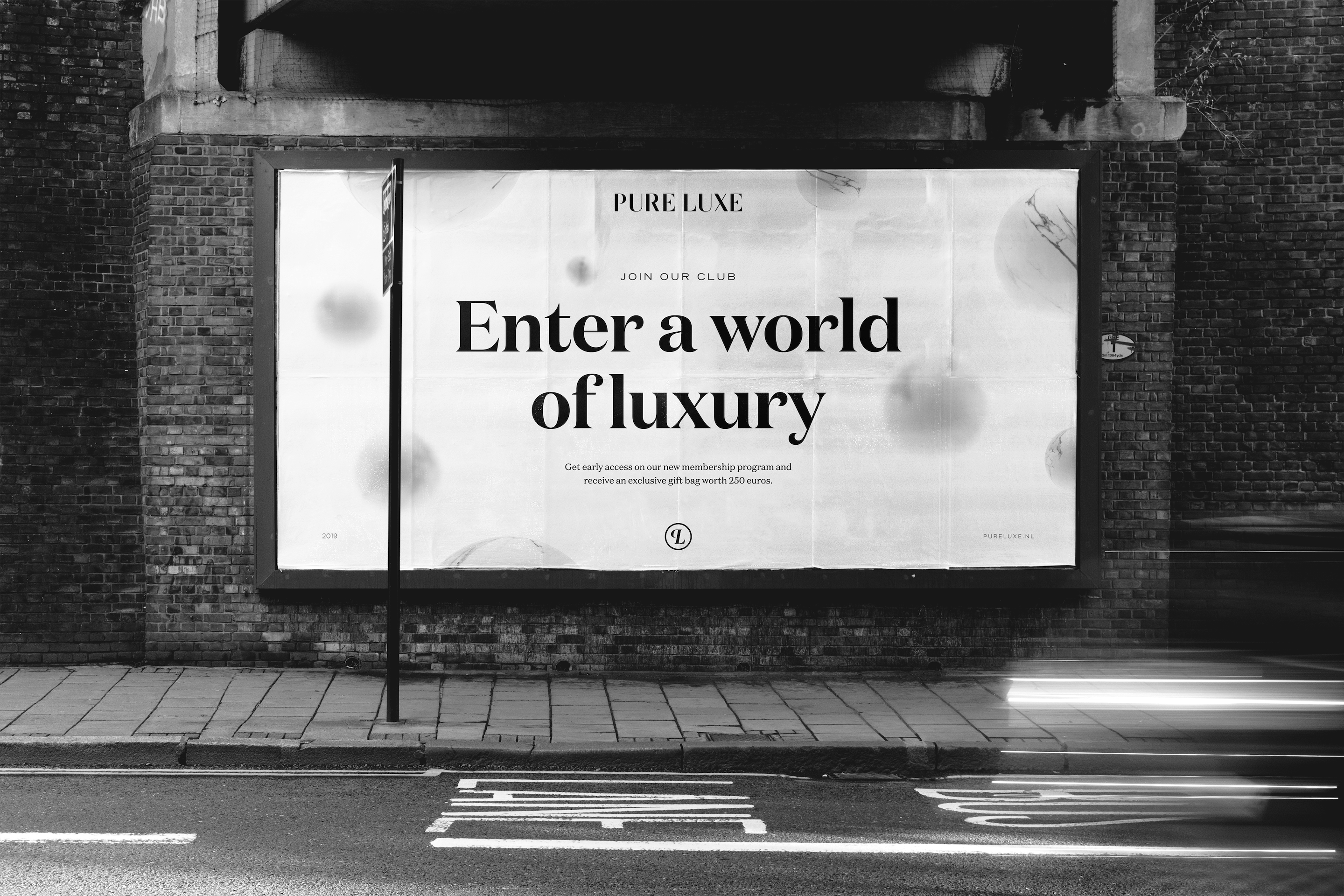
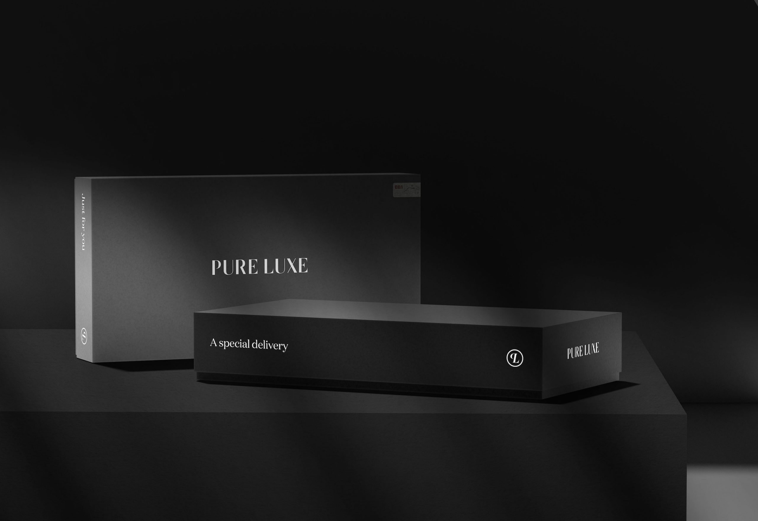
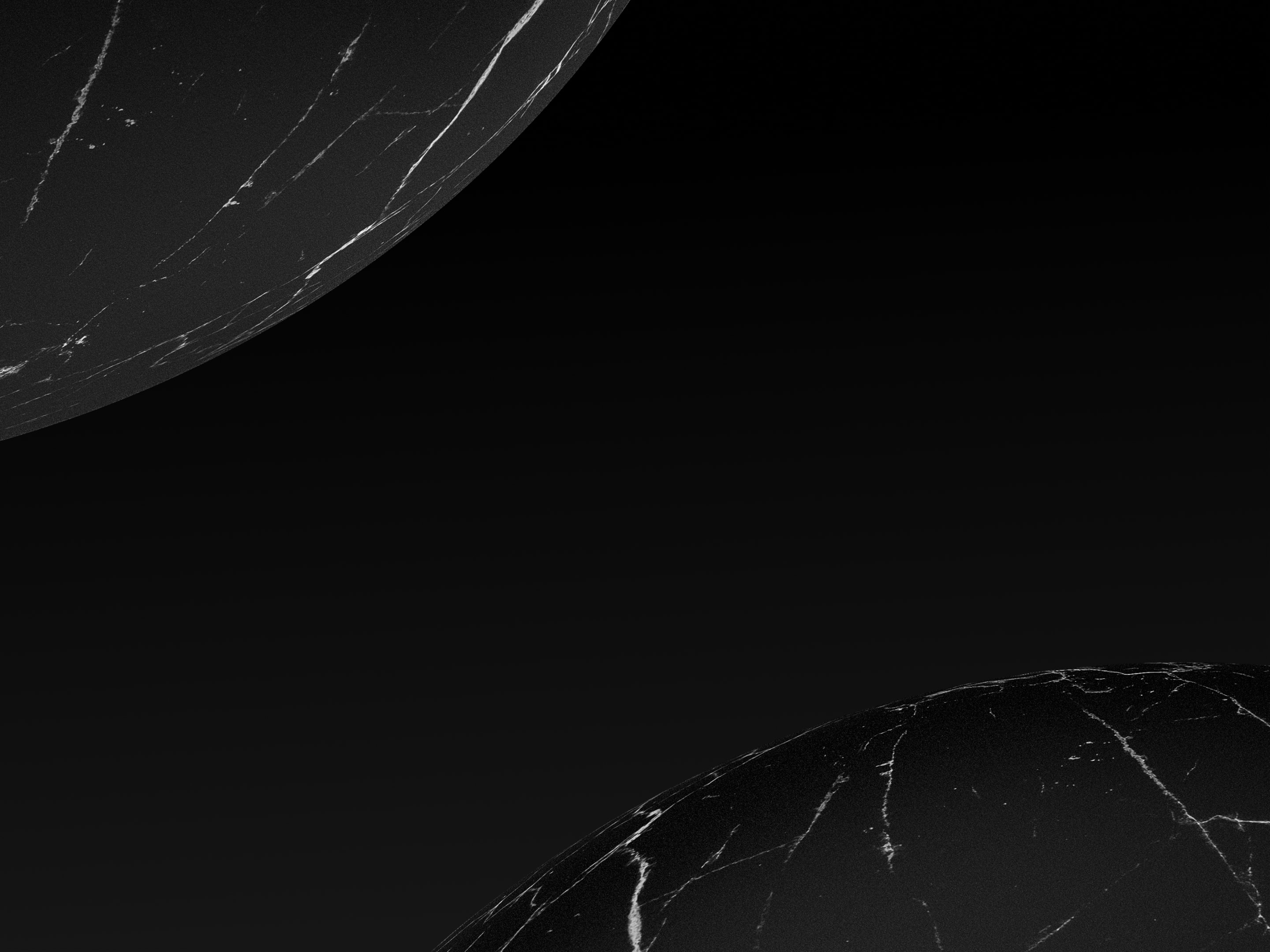
Marble Globes
As supporting graphics, either black or white marble globes are used on a dark or light background, respectively. The marble symbolises premium materials and craftmanship, while the globes symbolise the ‘world of luxury’ the readers can enter through Pure Luxe.
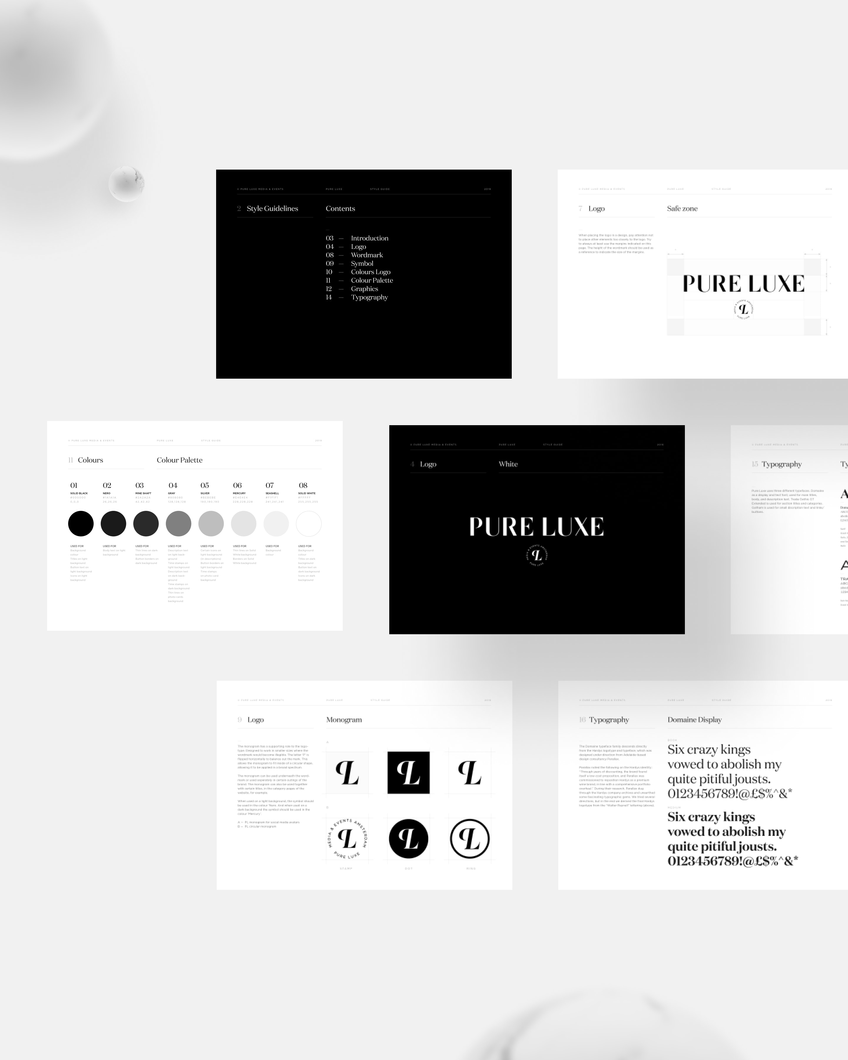
All decisions and specific uses for colours, text styles and other brand elements have been documented in the style guidelines as future reference for the brand.
1.0
©
Pick another case
Copyright
© Lucas Berghoef