


0.1
©
Digital Platform – Polestar
Grounding the future of Polestar’s platform
0.2
©
Polestar’s ambition of leading the automotive industry by example led them to choose code d’azur as their global digital partner. Together with the team at code, I took on the challenge to establish the foundation of Polestar.com – the digital platform for the luxury EV company.
As the first designer on code’s dedicated team back in 2019, I initiated the digital art direction and laid the foundation for Polestar’s design system. With a focus on scalability to support for the imminent growth of both the team and the brand.
Client:
Polestar
Year:
2019 – 2020
Agency:
code d’azur
My Role:
Digital Designer & Art Director
0.3
©
Digital Art Direction
One of my key responsibilities was to create the digital art direction for Polestar.com, together with Directors Priscilla de Gier and Dani Polak. Which involved defining the overall visual style and tone of the website. All in close collaboration with Stockholm Design Lab, who designed the brand identity for Polestar.
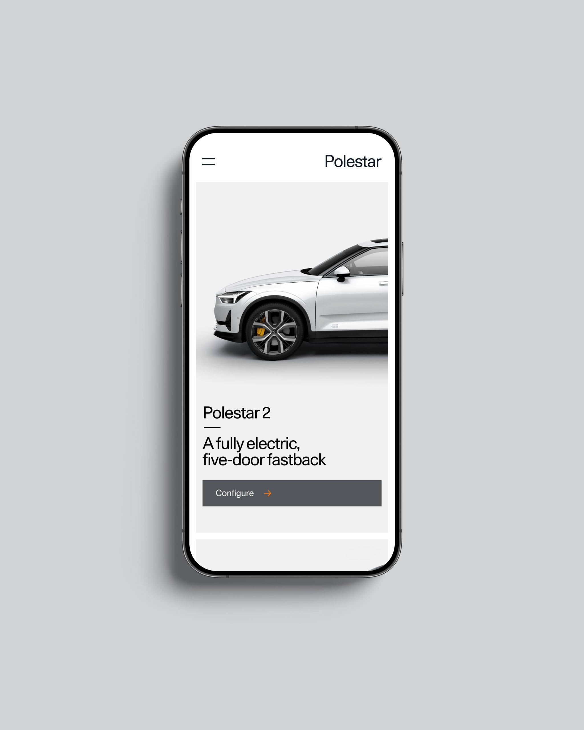
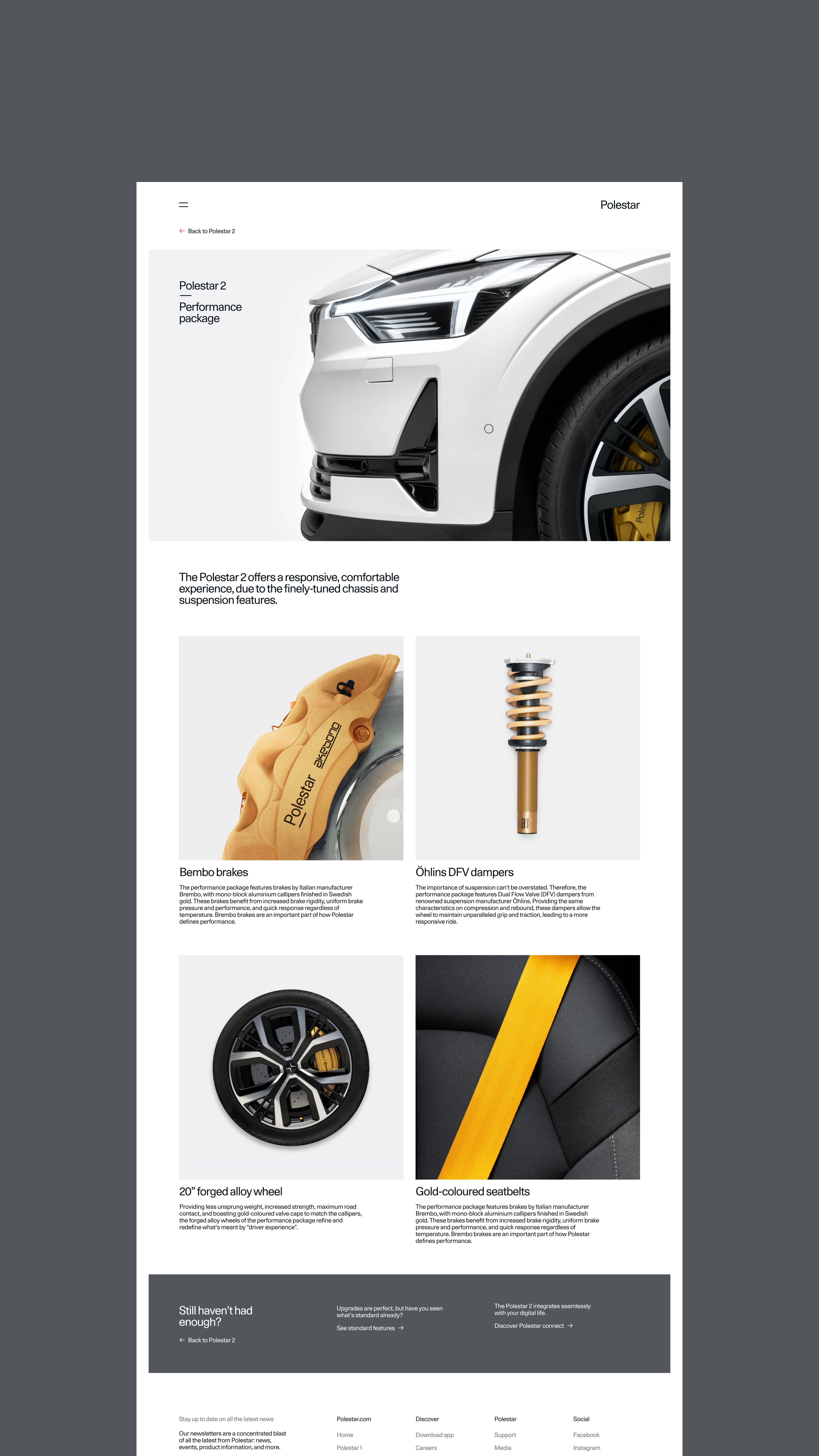
Blown up numerals serve as the backdrop to the iconic cars to create an eye catching hero for the PDPs.
Product on a pedestal
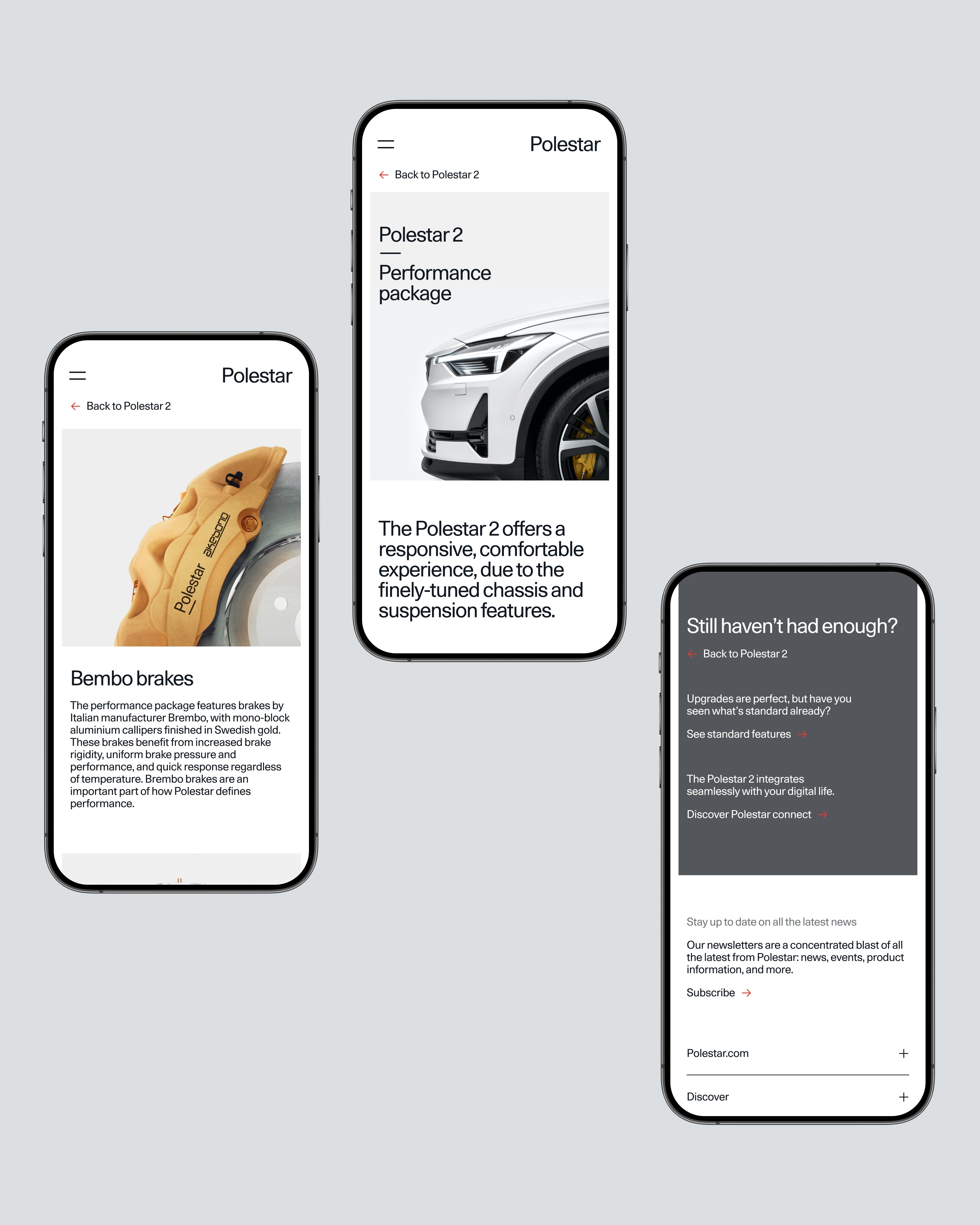
The design for the product pages put the focus on the cars by removing unnecessary elements and giving them ample space to shine. The vehicles were framed with a small passe-partout around core imagery, emphasising their iconic details and drawing the user’s attention to key features. The end result is a simple and elegant design that puts the cars at the forefront.
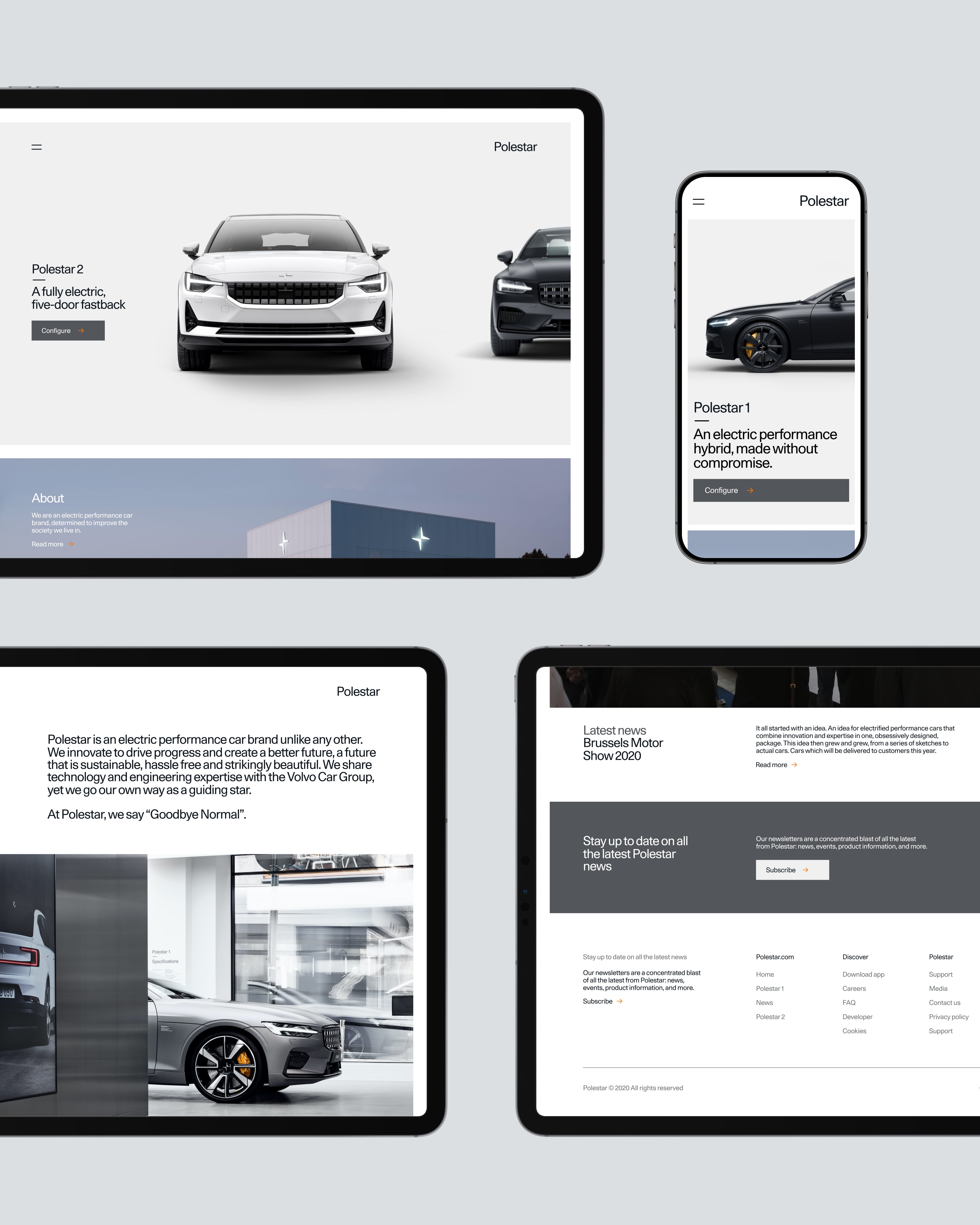
Homepage featuring a hero carousel with the two Polestar models released at that time.
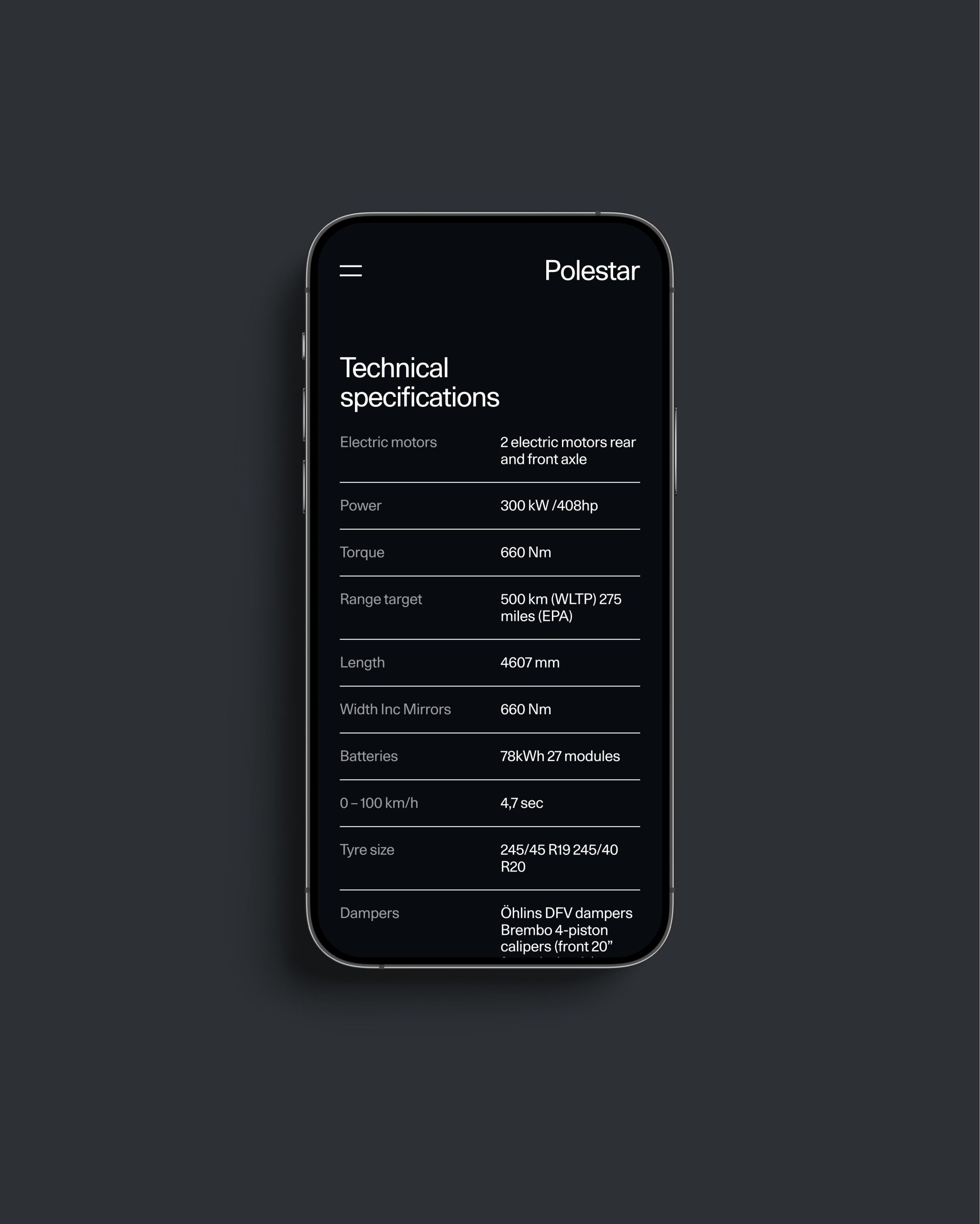
Sub-pages for the PDPs feature additional information with an easy way of returning to the PDP through sub-navigation.
One weight to rule them all
The brand typography guidelines by SDL emphasised the use of only 1 weight, 2 type sizes and a strict left alignment, making it a challenge to establish clear hierarchy. However, this limitation ultimately resulted in a clean and minimal design. The adherence to these rules produced a recognisable brand language with the use of minimal elements.
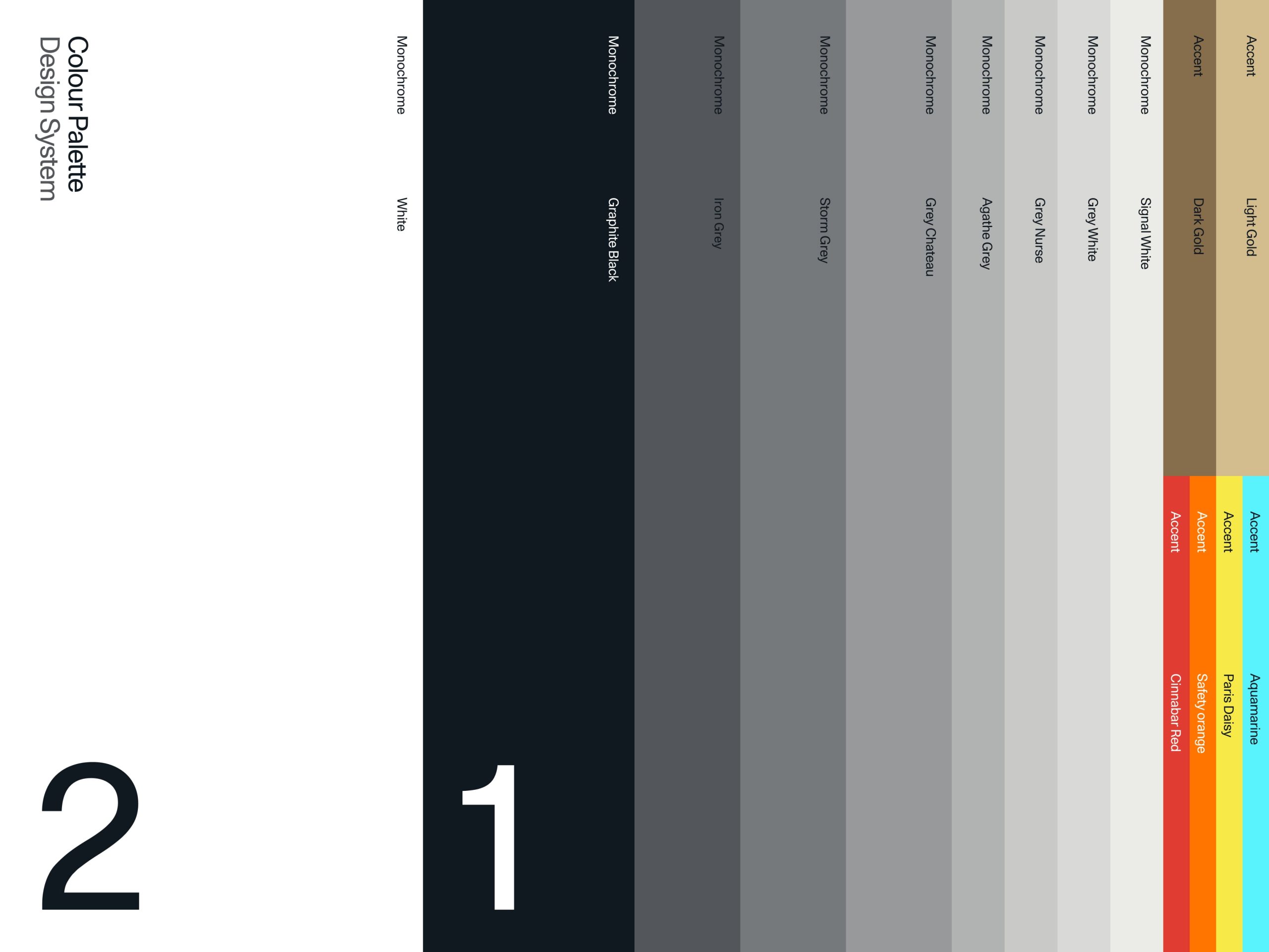
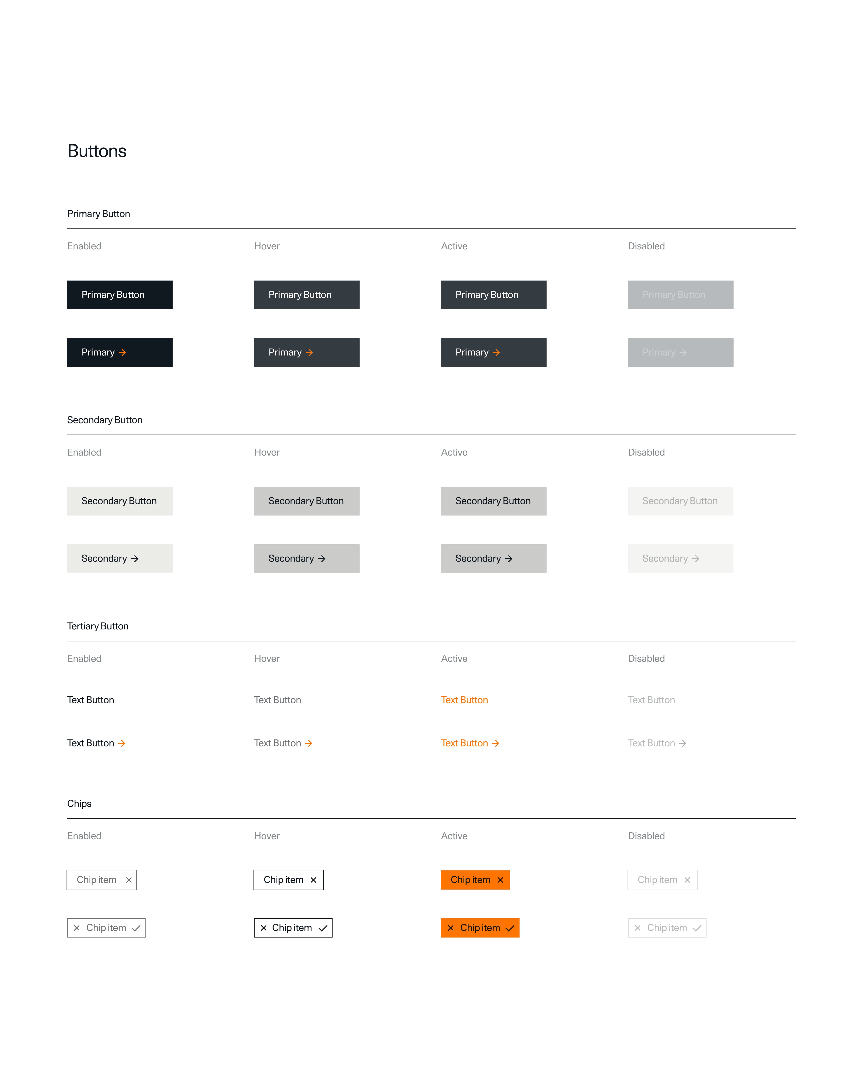
Initial setup of Polestar’s design system
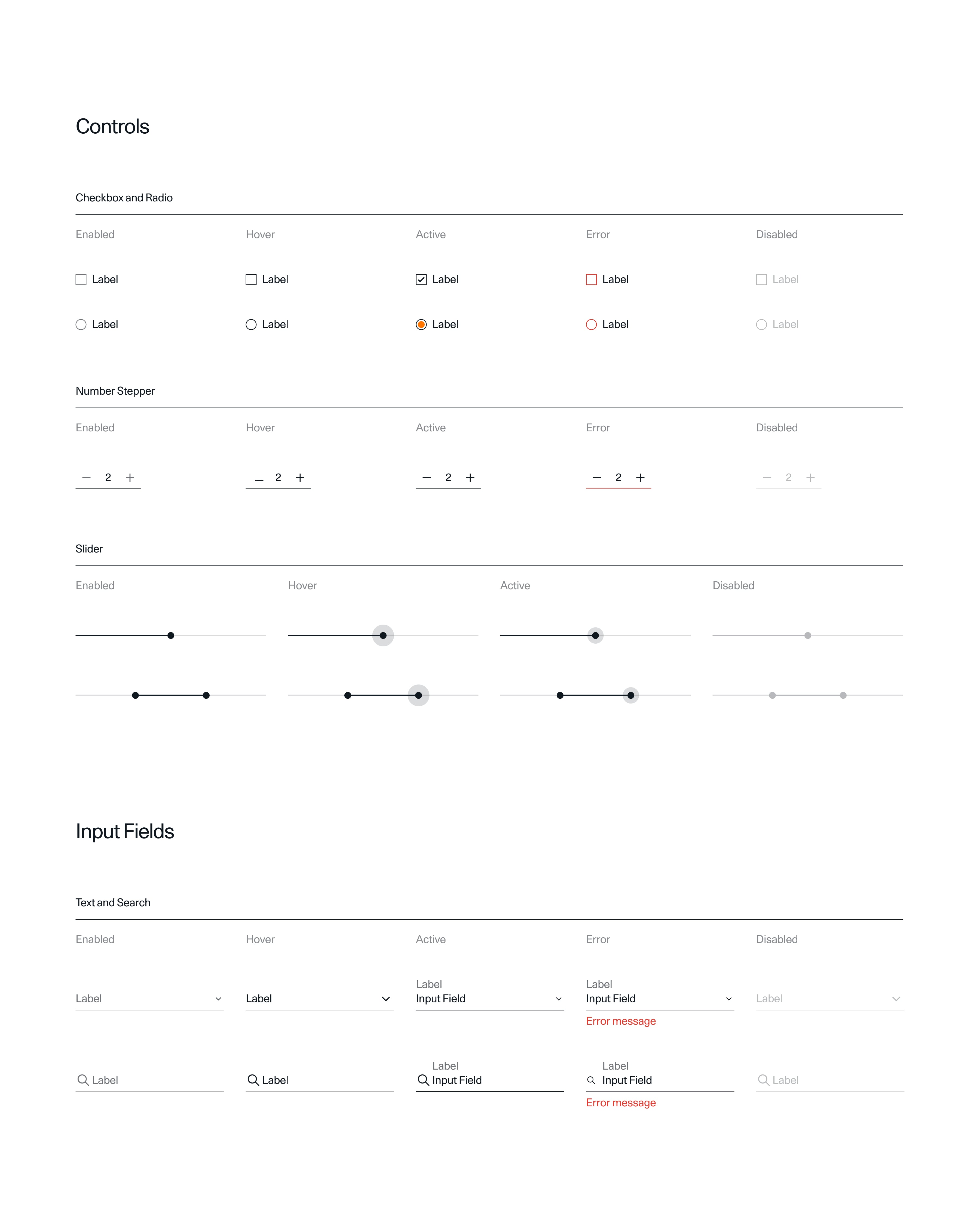
During the early stages of building the platform, I played a key role in establishing a comprehensive design system for Polestar. Working in tandem with the development team to create a system that was not only consistent and efficient, but also easily scalable as the company grew. To ensure its longevity, I documented the key styles and components, including their anatomy, behaviour, and specifications. Followed by a dedicated team taking over the work as we scaled up.
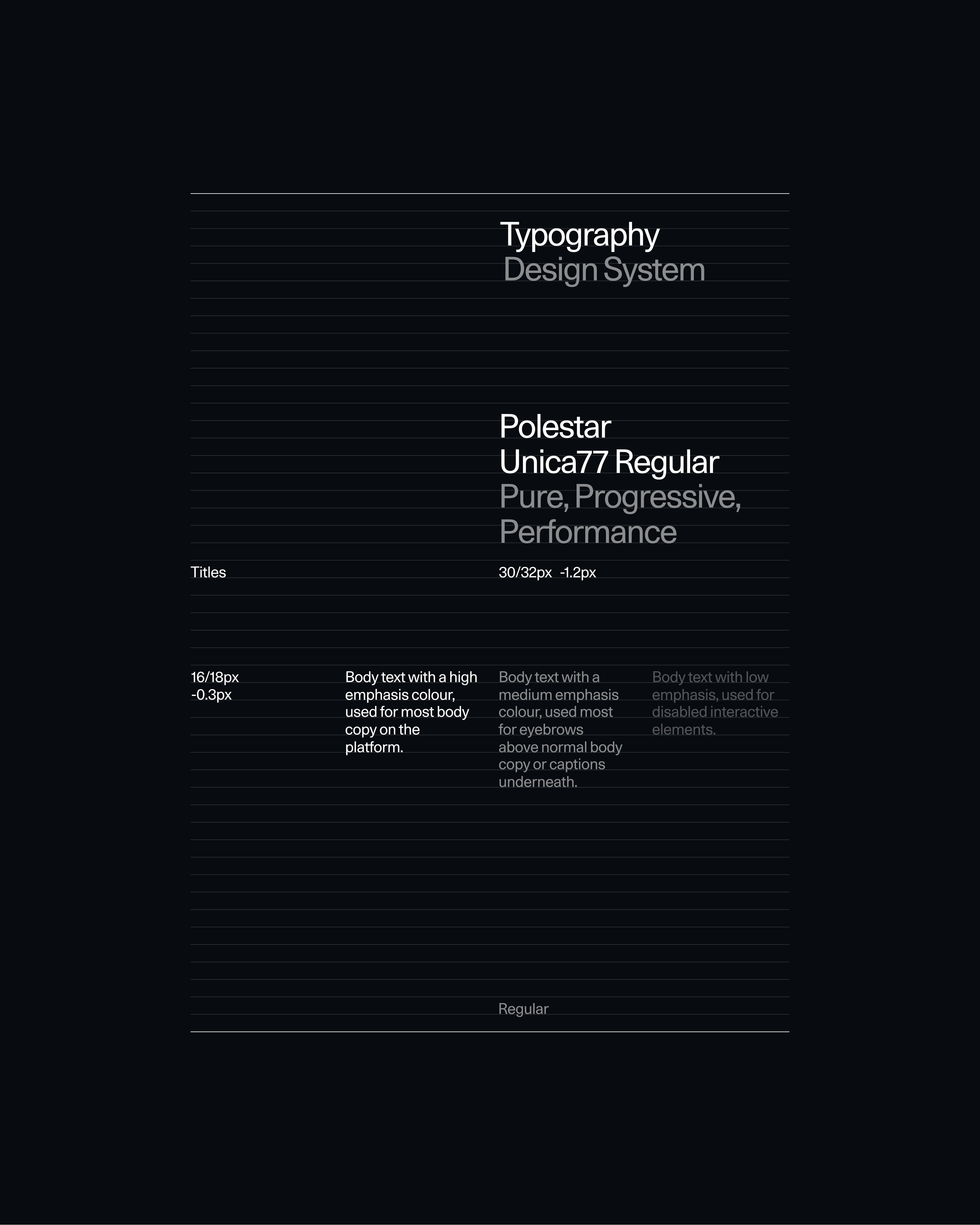
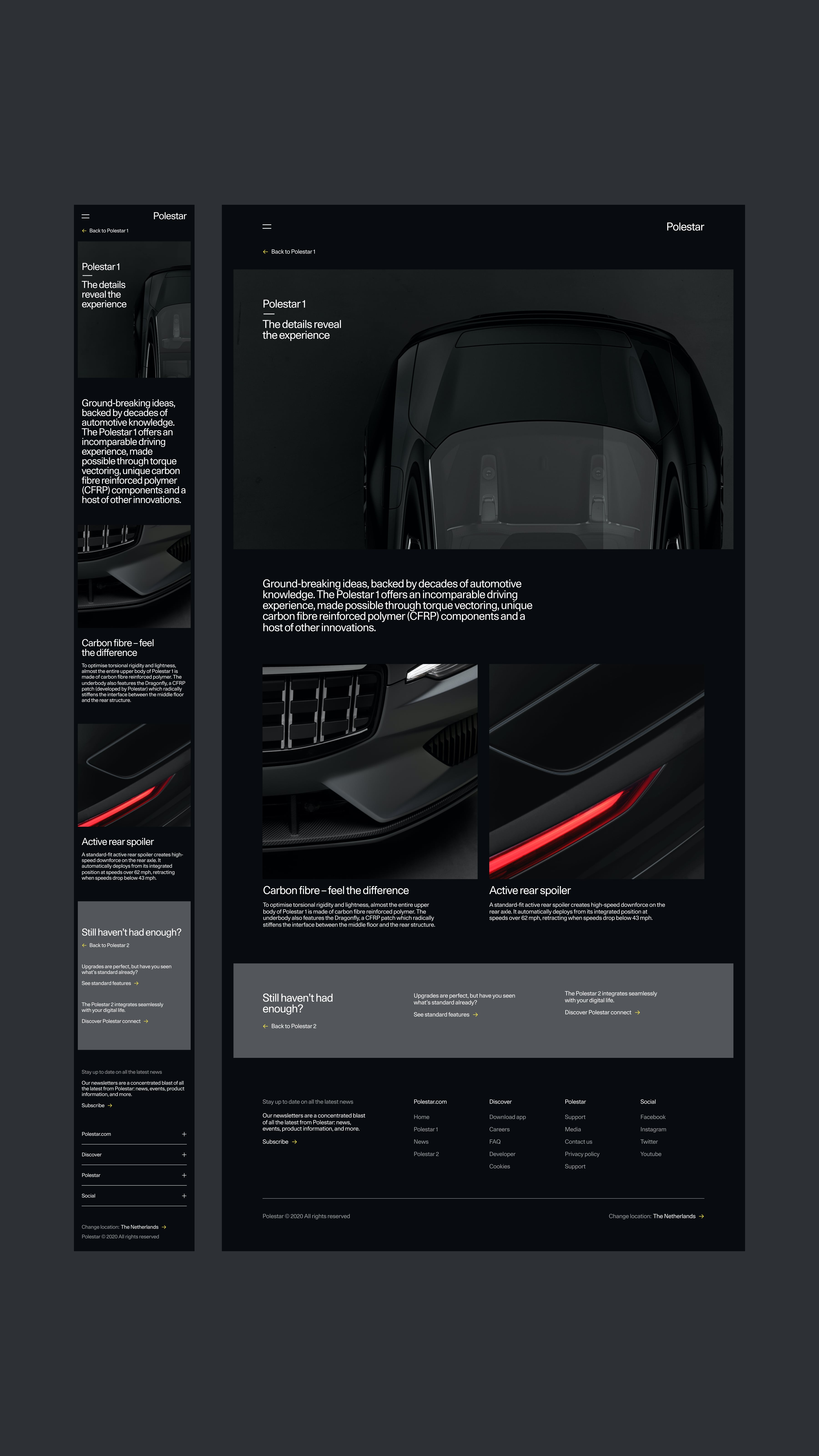
Text styles in the design system are limited to one weight, two sizes and a strict left alignment.
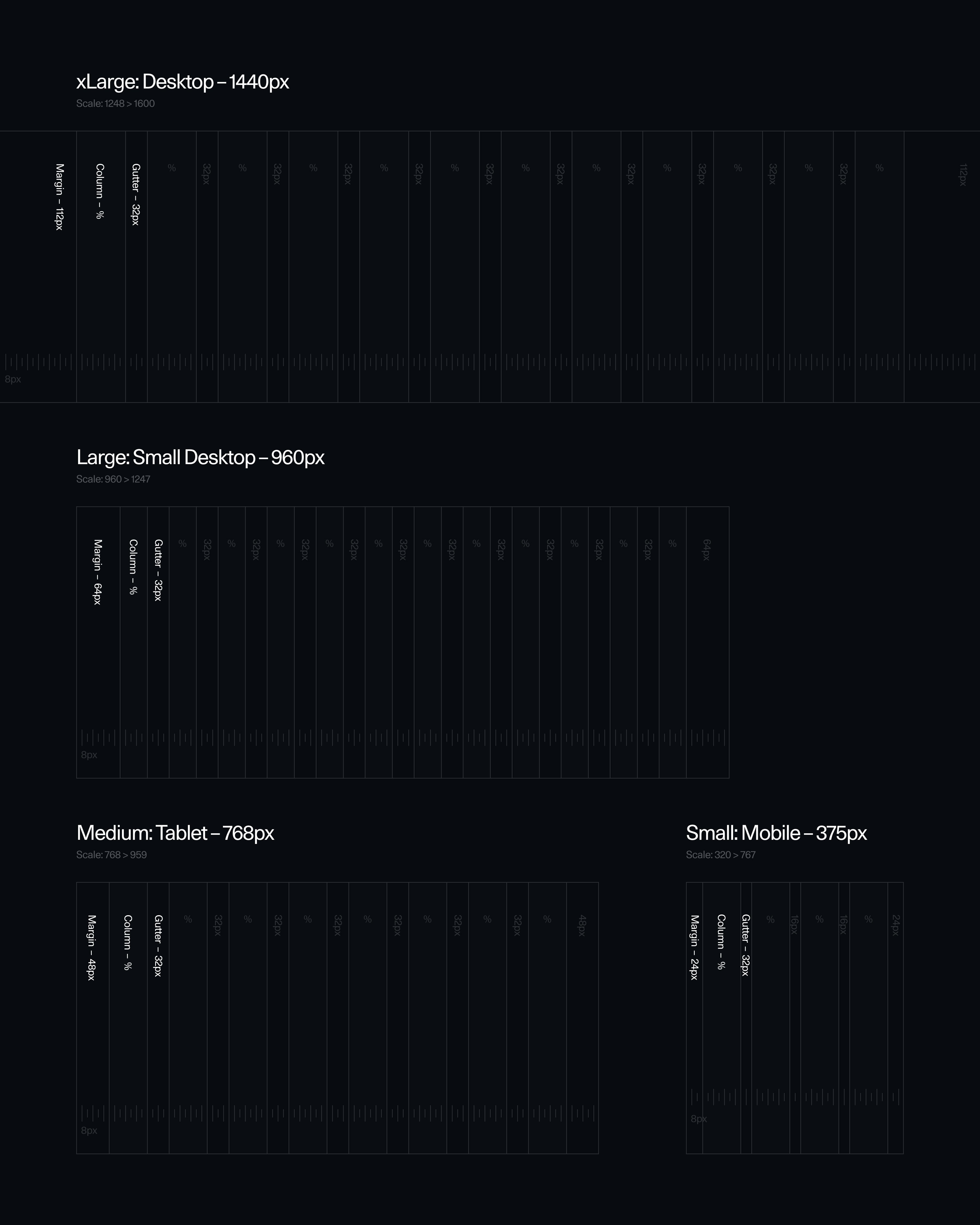
Global grids are used on every page of the platform to maintain key lines, resulting in recognisable layouts.
1.0
©
Pick another case
Copyright
© Lucas Berghoef